

BRAND
DATEABLE 831 | REDESIGN
OVERVIEW
The initial brief called for a "bold yet calm and cool" mark — coral, teal, and dark gray, using Roca as the primary typeface. The tone the client described was distinctly beach-town: "I'm happy and calm, I'm at the beach.”
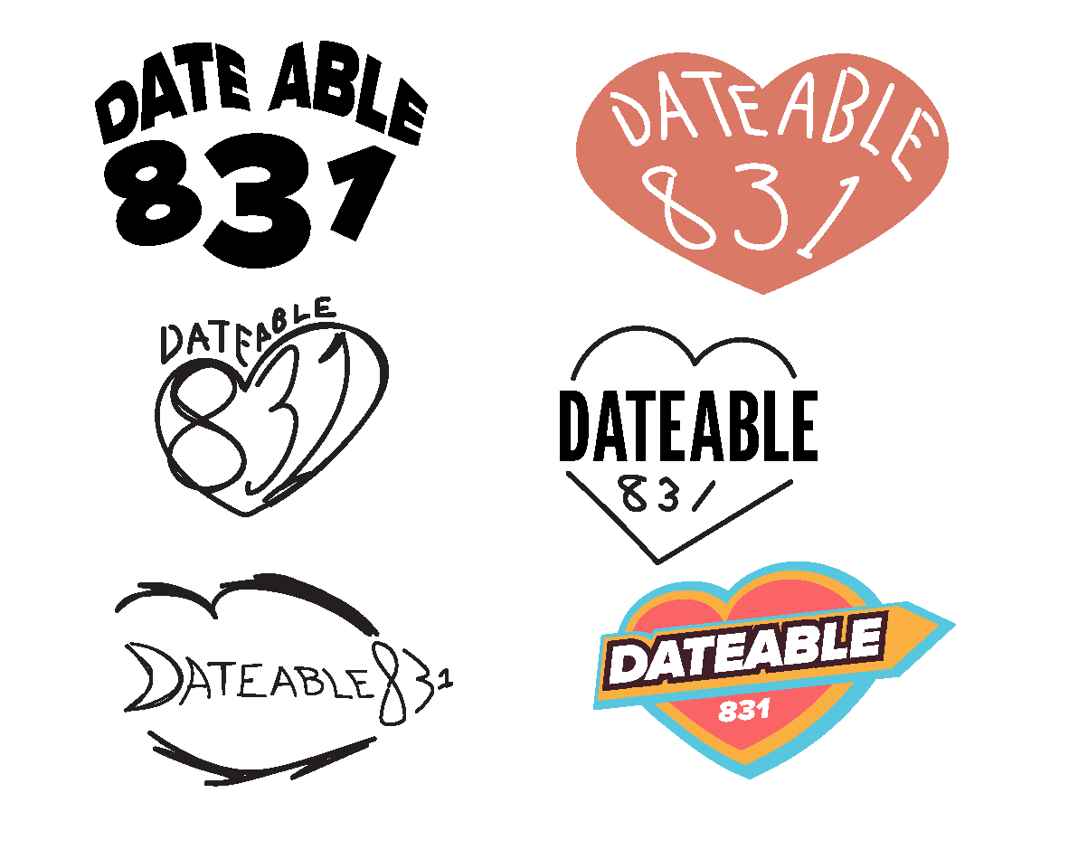
CONCEPT 1

The first direction of this concept — a heart outline with a rough, sketchy line-art style and hand-drawn type — got specific, constructive criticism:
The lettering execution felt weak and under-crafted
The loose, modern line-art heart didn't mesh well with the vintage type
The overall style didn't yet feel cohesive
This pushed the design toward a more polished, retro sticker aesthetic: a solid heart shape (rotated slightly for movement), bold layered outlines, and a proper vintage script typeface rather than a hand-drawn approximation.
THE PIVOT
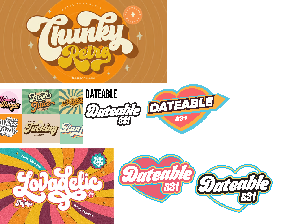
In debrief, the client's reaction to the initial direction was clear: it wasn't landing. Talking through what wasn't working, it turned out the brief itself hadn't fully captured what they wanted — they were actually after something with a 70s vintage aesthetic: chunky retro lettering, layered outline effects, warmer nostalgic colors. Rather than iterate further on the beach-calm direction, the project pivoted to a full restyle.
CONCEPT 2
FINAL ITERATION
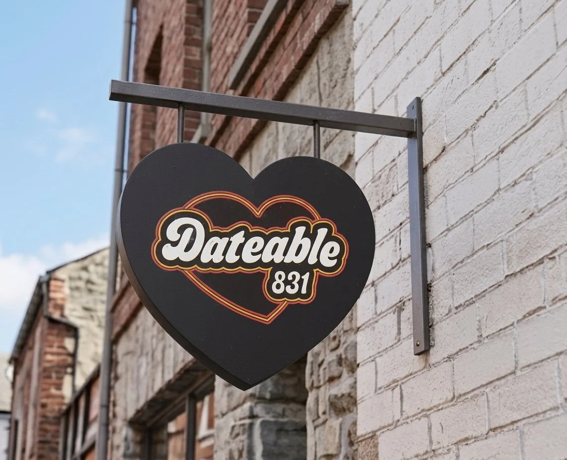
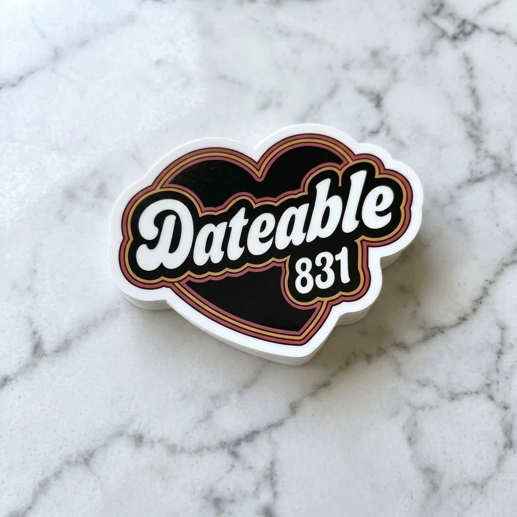
The final mark is a heart badge with "Dateable" in a bold retro script and "831" set below in a chunky companion numeral style, wrapped in layered pink-and-yellow outlines against a solid heart — landing solidly in 70s sticker/patch territory while staying legible at small sizes.
GUIDELINES
#E9BD49
#D96774
Heart shape is slightly rotated
Text has a subtle flag-shaped distortion
Typeface: Budge Regular
REFLECTION
The biggest lesson from this project was the value of debrief conversations, not just brief documents. The original written brief for Dateable 831 and what the client actually wanted turned out to be two different things — and a single round of direct conversation surfaced that gap faster than another round of revisions would have. Being willing to restart a visual direction from scratch, rather than trying to force the client's original brief into something they'd already rejected, ended up being the right call.