

BRAND
SUSHI KUMA | REDESIGN
OVERVIEW
The client’s original logo had a bear claw grabbing a fish. The direction called for something minimalist, with one foot in traditional Japanese sushi-shop iconography and one in a more modern, approachable style. The client's mood-board leaned heavily on classic badge-style sushi logos — circular emblems, bold sans-serif type, seals and ribbons — but explicitly noted the reference wasn't a hard constraint: "you don't have to use a logo as a reference."
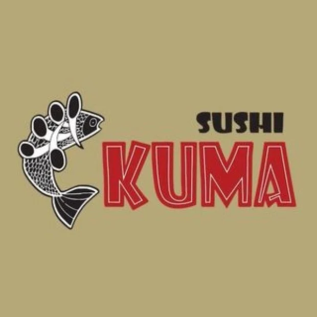
CONCEPT STAGE
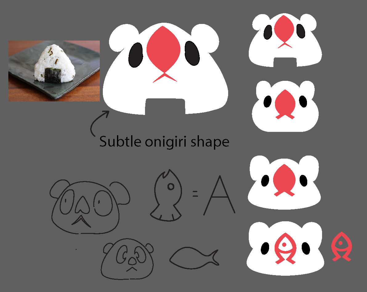
FEEDBACK

Rather than keep refining the illustrative claw-and-fish scene, the direction shifted toward a more abstract solution: instead of the bear holding a fish, the fish could become part of the bear—specifically, its face. The first version of this new mascot-face direction introduced a stylized "A"-like fish/nose motif, but client feedback flagged two specific issues:
The nose sat too high on the face, throwing off the proportions
The fish shape read as too literal — closer to a bird's beak than a fish
THE PIVOT
Each round of revisions nudged the nose down and simplified the fish silhouette further, moving from a more illustrative fish (with visible fins and a curved body) to a clean teardrop shape with a simple mouth line — subtle enough to sit naturally as a nose, but still unmistakably fish-shaped up close.
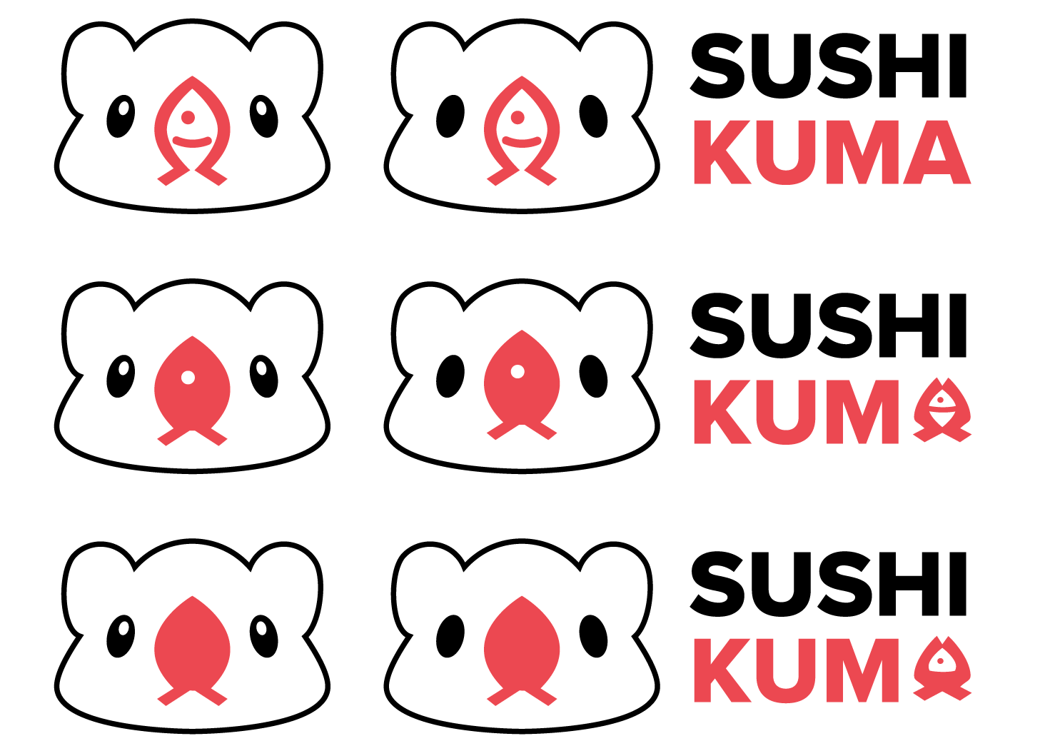
FINAL ITERATION
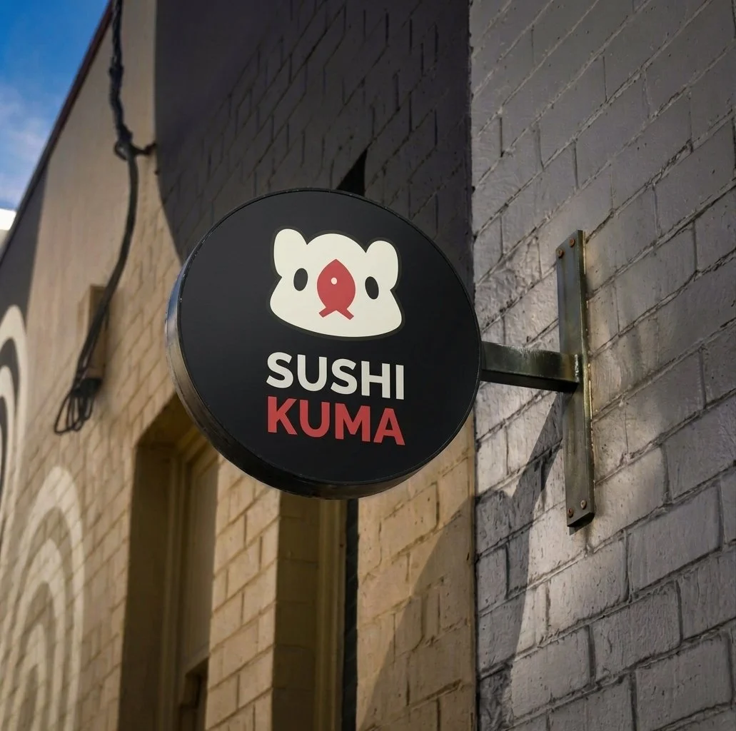
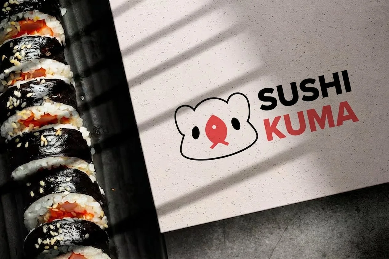
The finished mark pairs a soft, rounded bear head with a red fish-shaped nose and simple oval eyes — playful enough to work as a mascot, restrained enough to hold up as a small icon on packaging or signage.
GUIDELINES
#DA5556
Nose sits slightly below center — not perfectly centered
Typeface: Proxima Bold